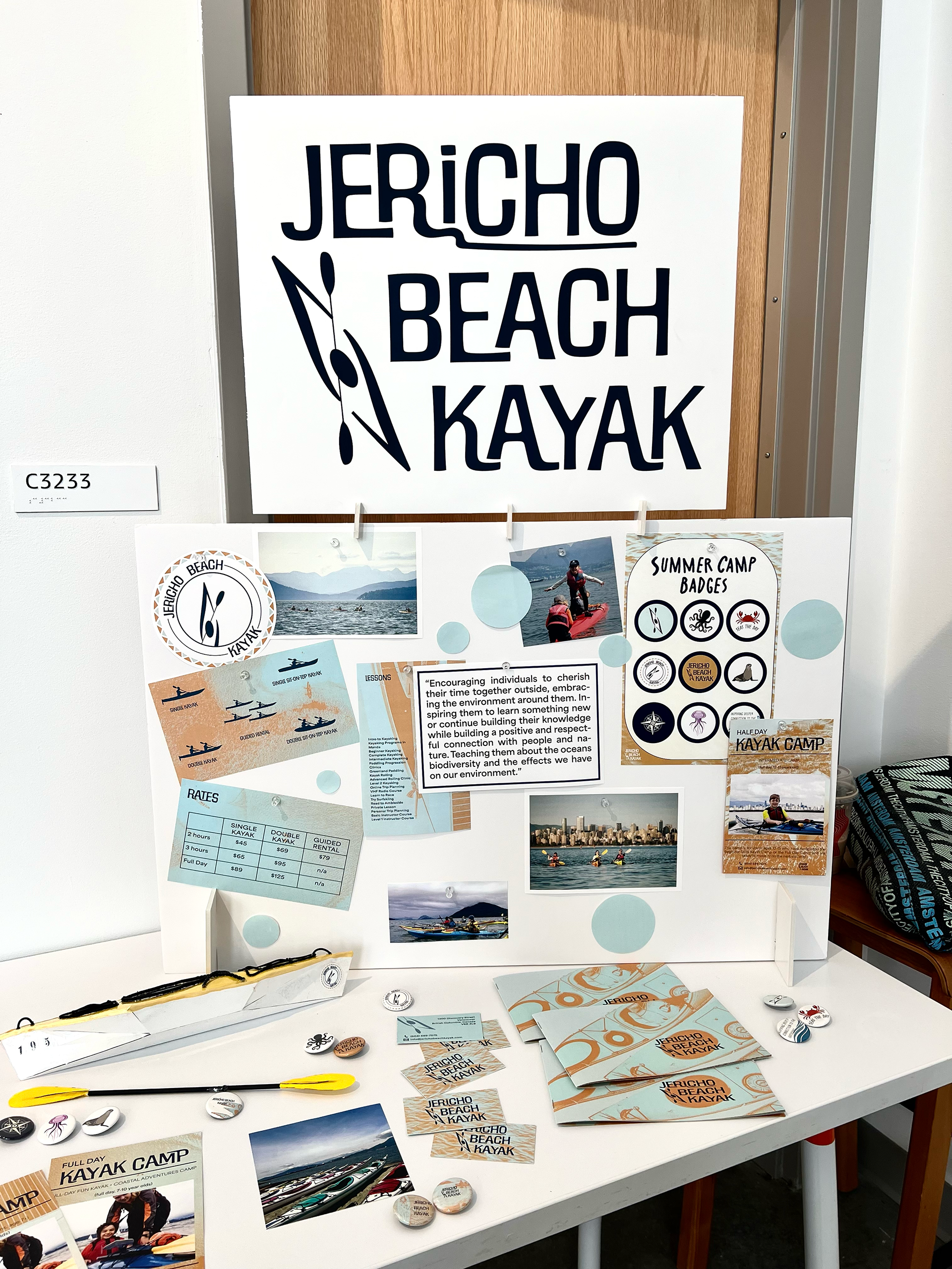
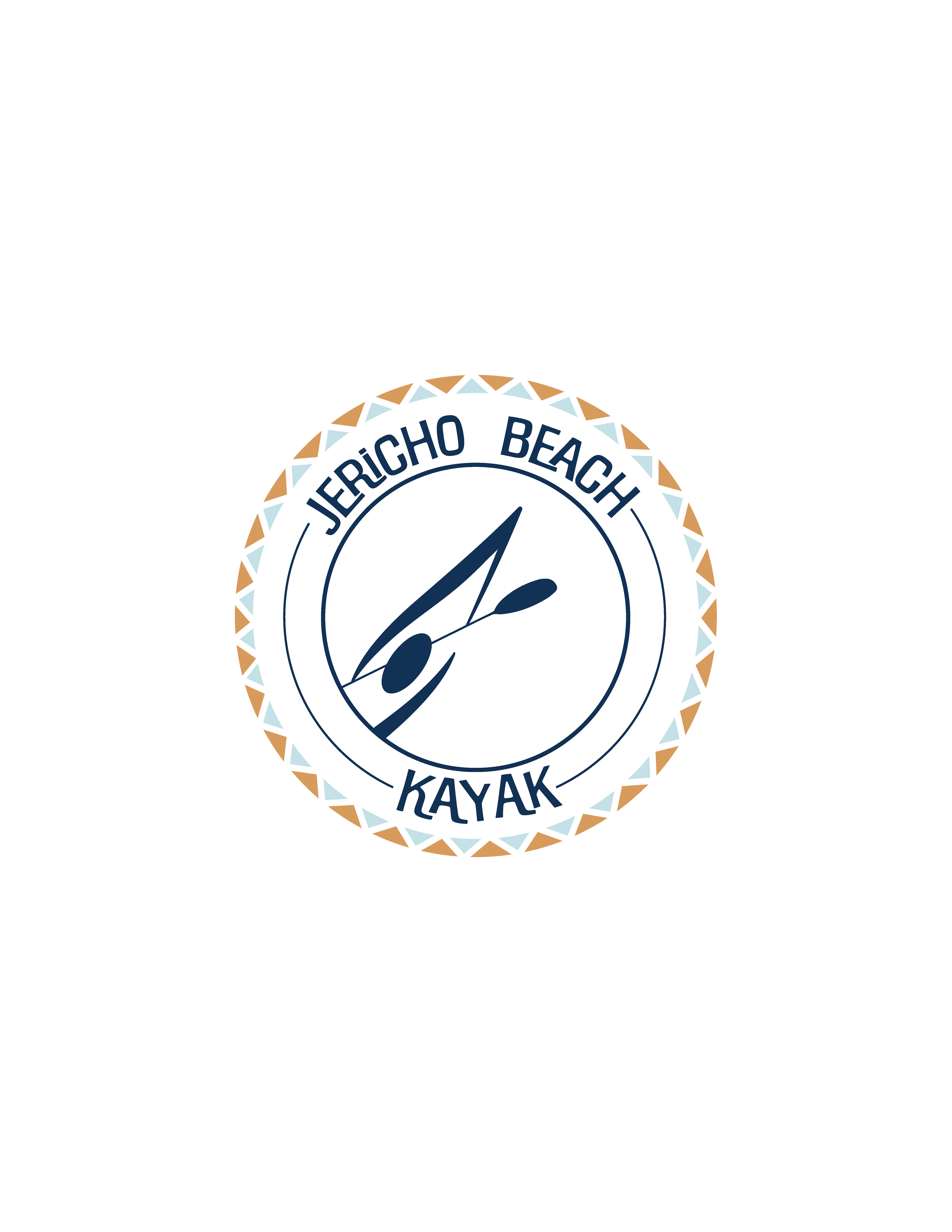
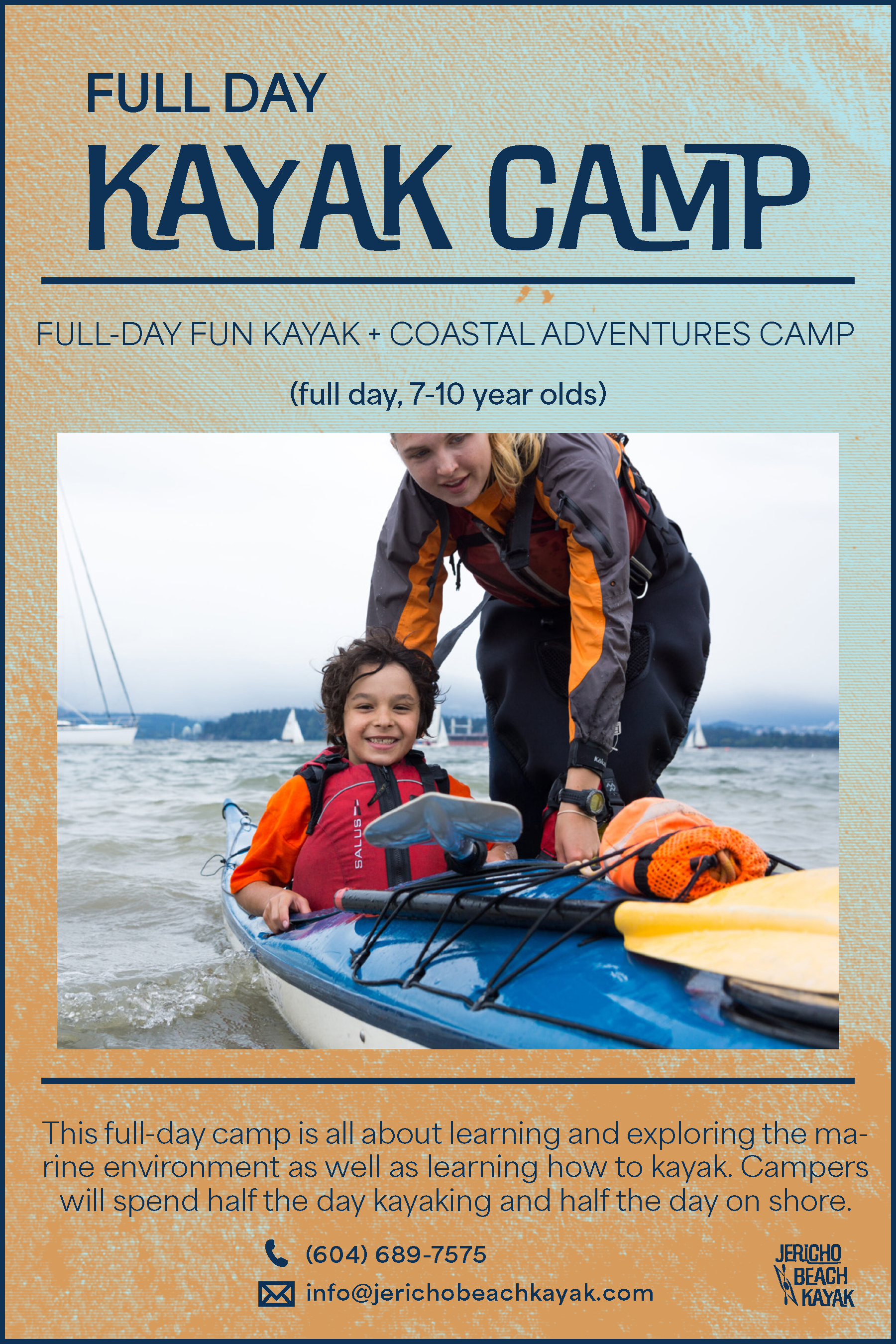
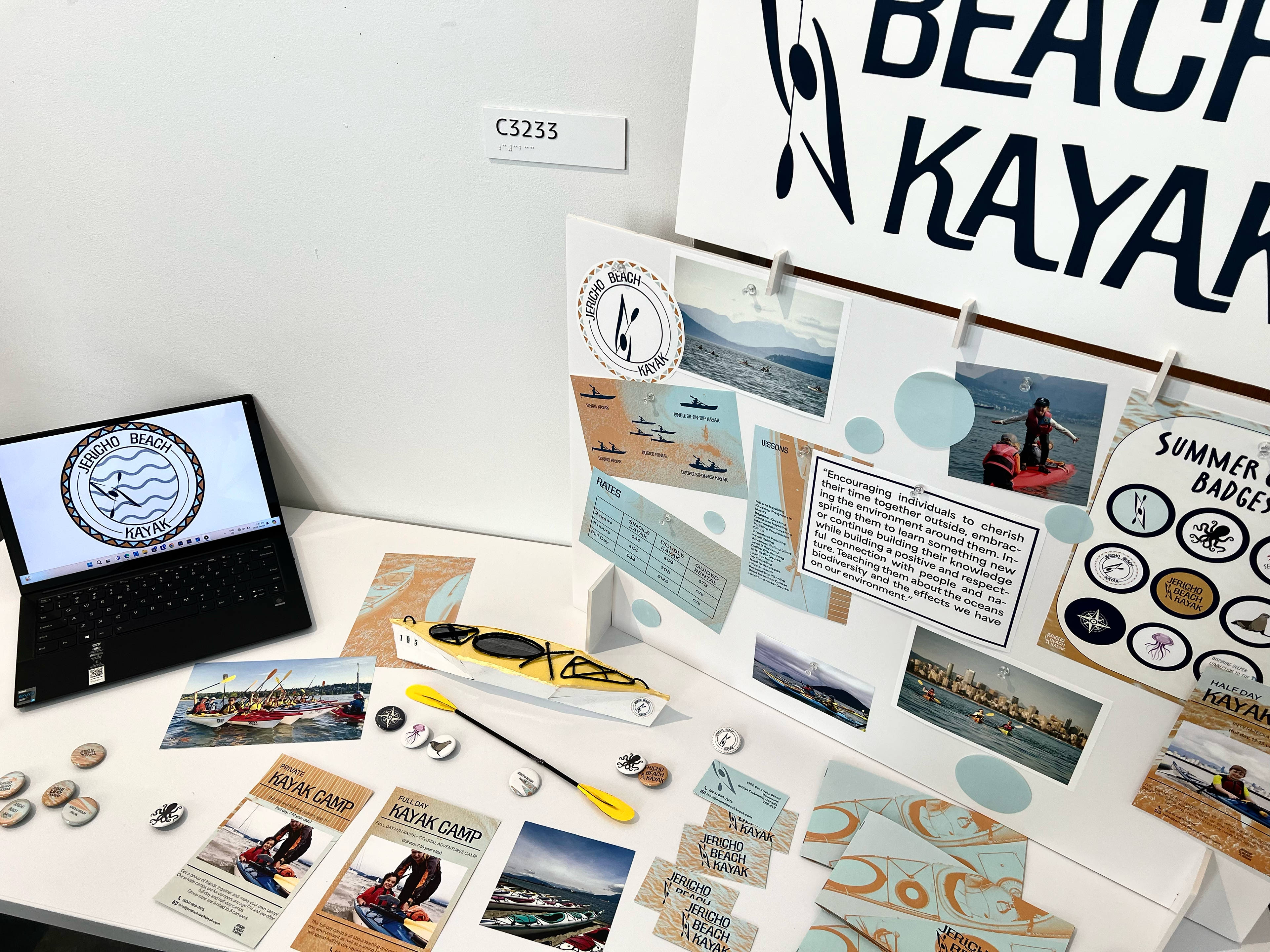
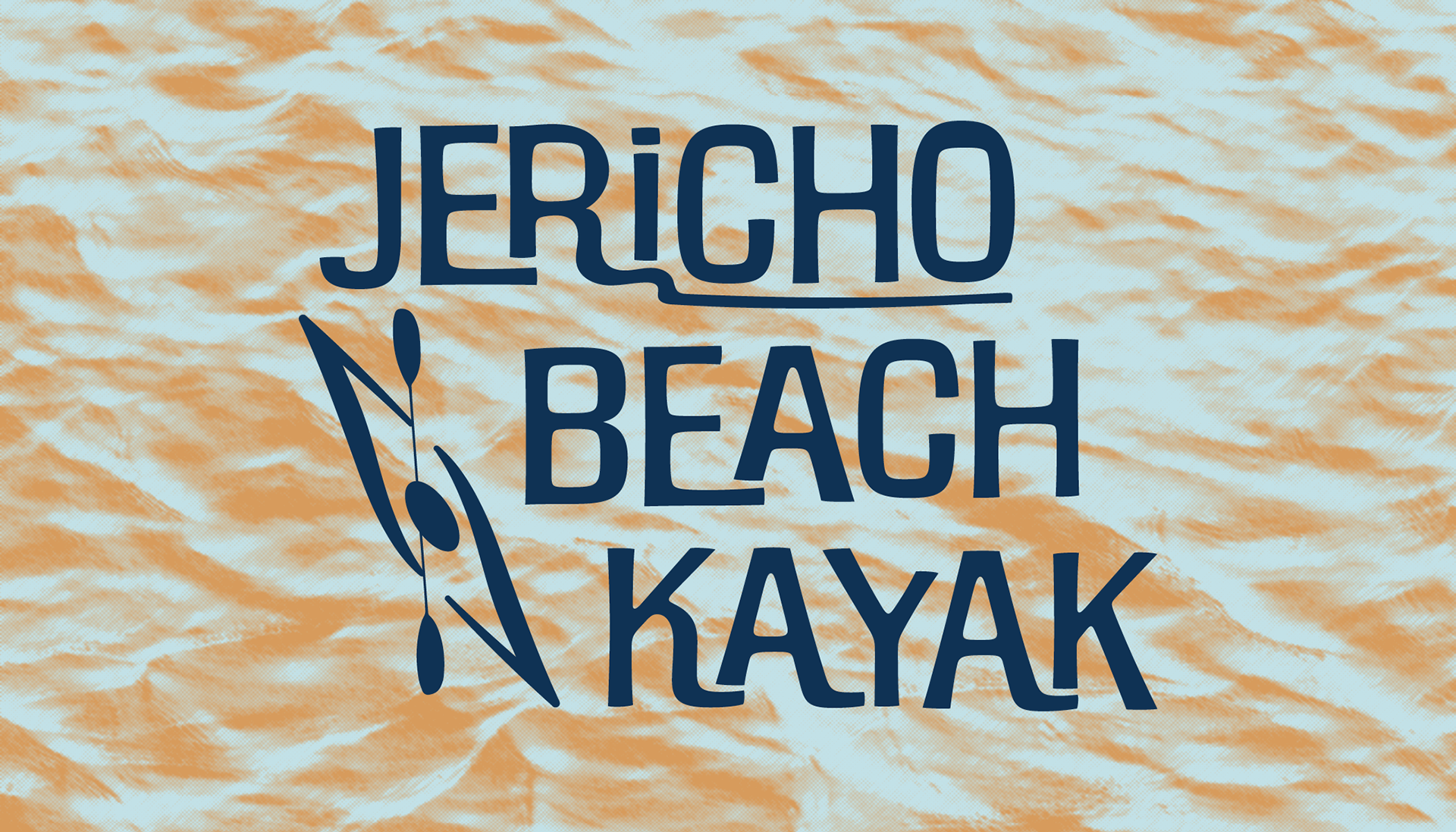
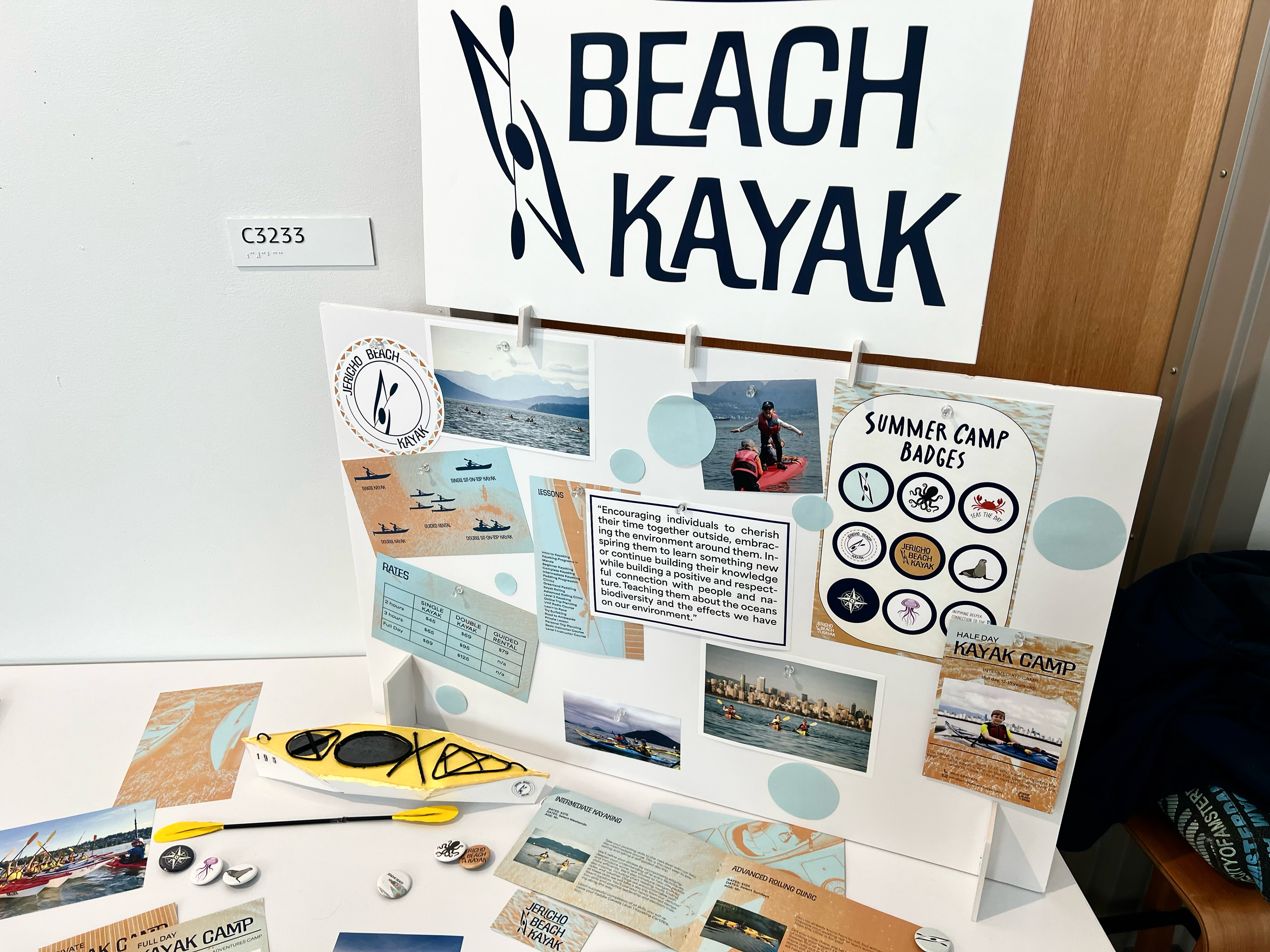
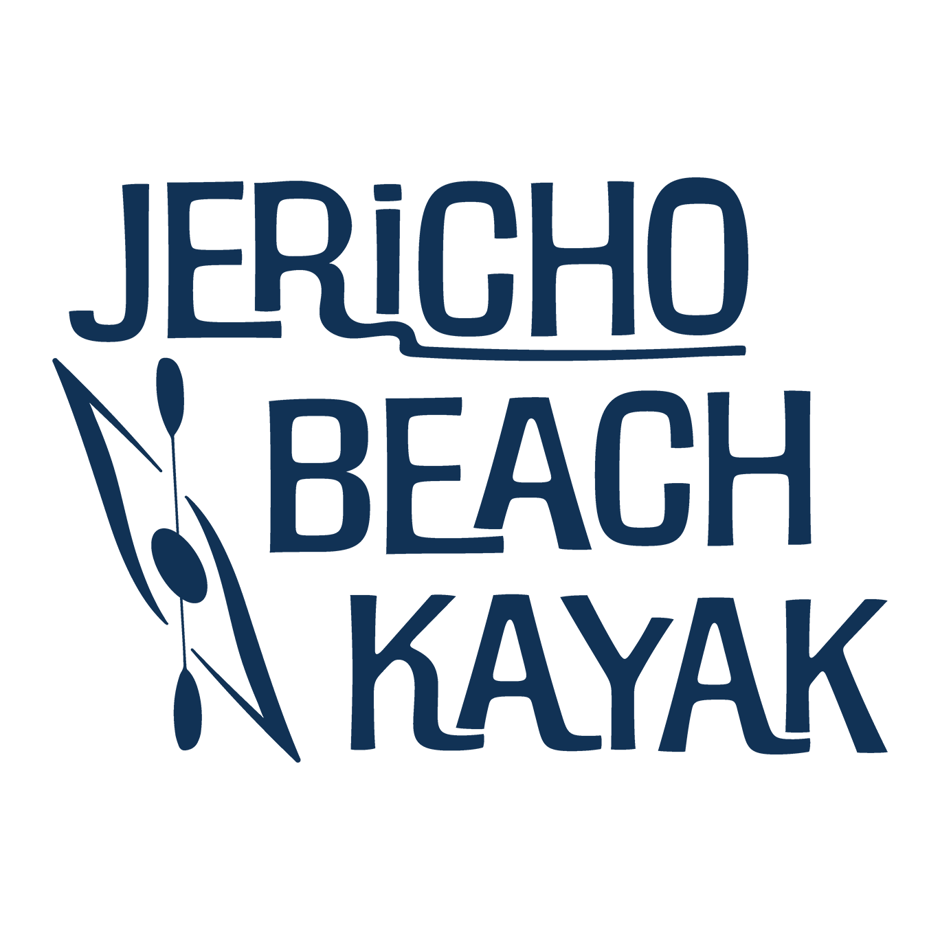
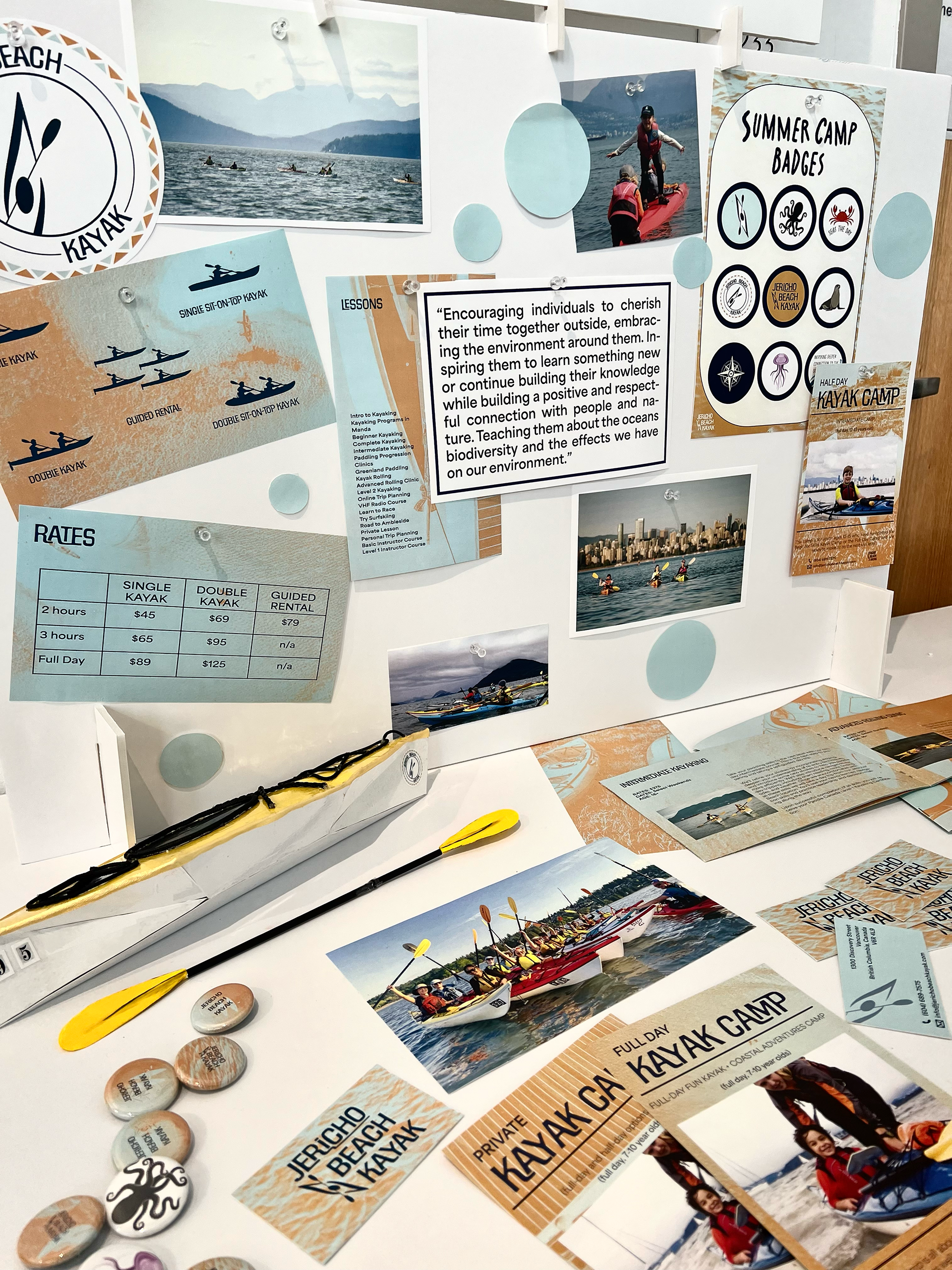
In class, we were assigned to work in groups to rebrand an existing brand of our choice. My partner and I chose Jericho Beach Kayak, whose original logo felt plain and disconnected from their theme. We aimed to make the brand feel more approachable, choosing a font that was both outdoorsy and wavy to evoke a sense of adventure. We designed two logos: one as the main and the second for assets, more playful version for camps and other fun activities to make it more child-friendly.
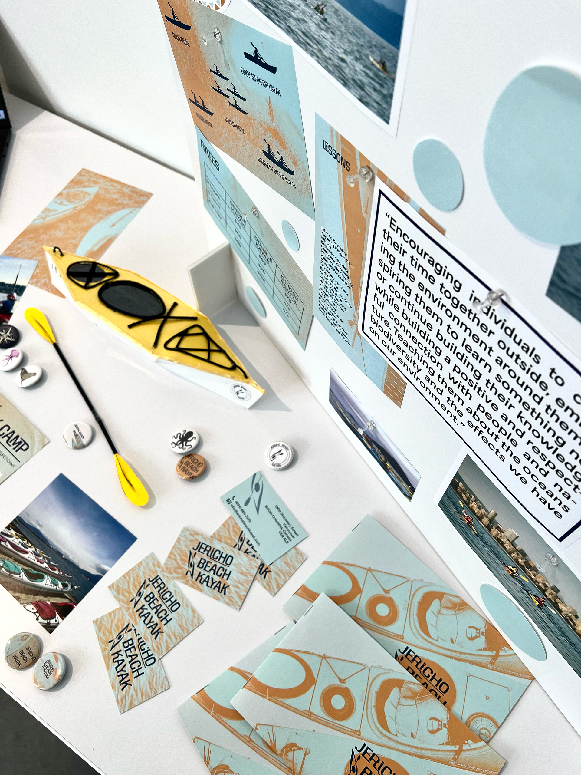
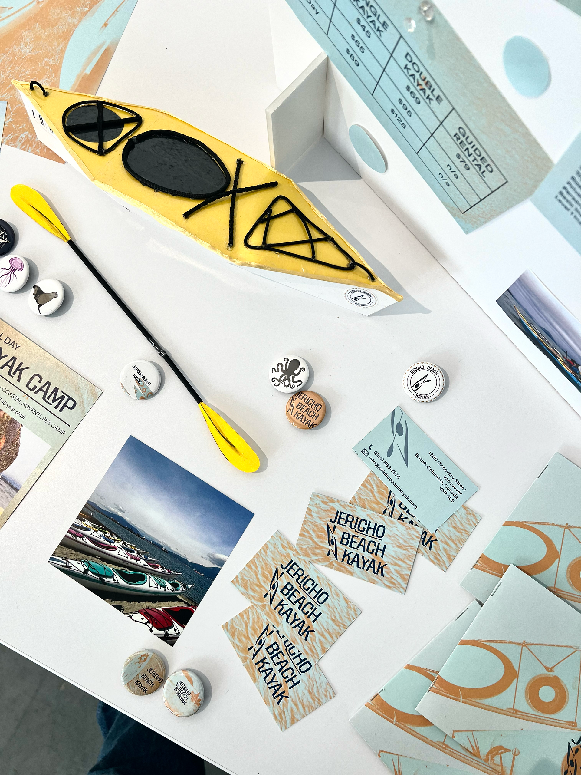
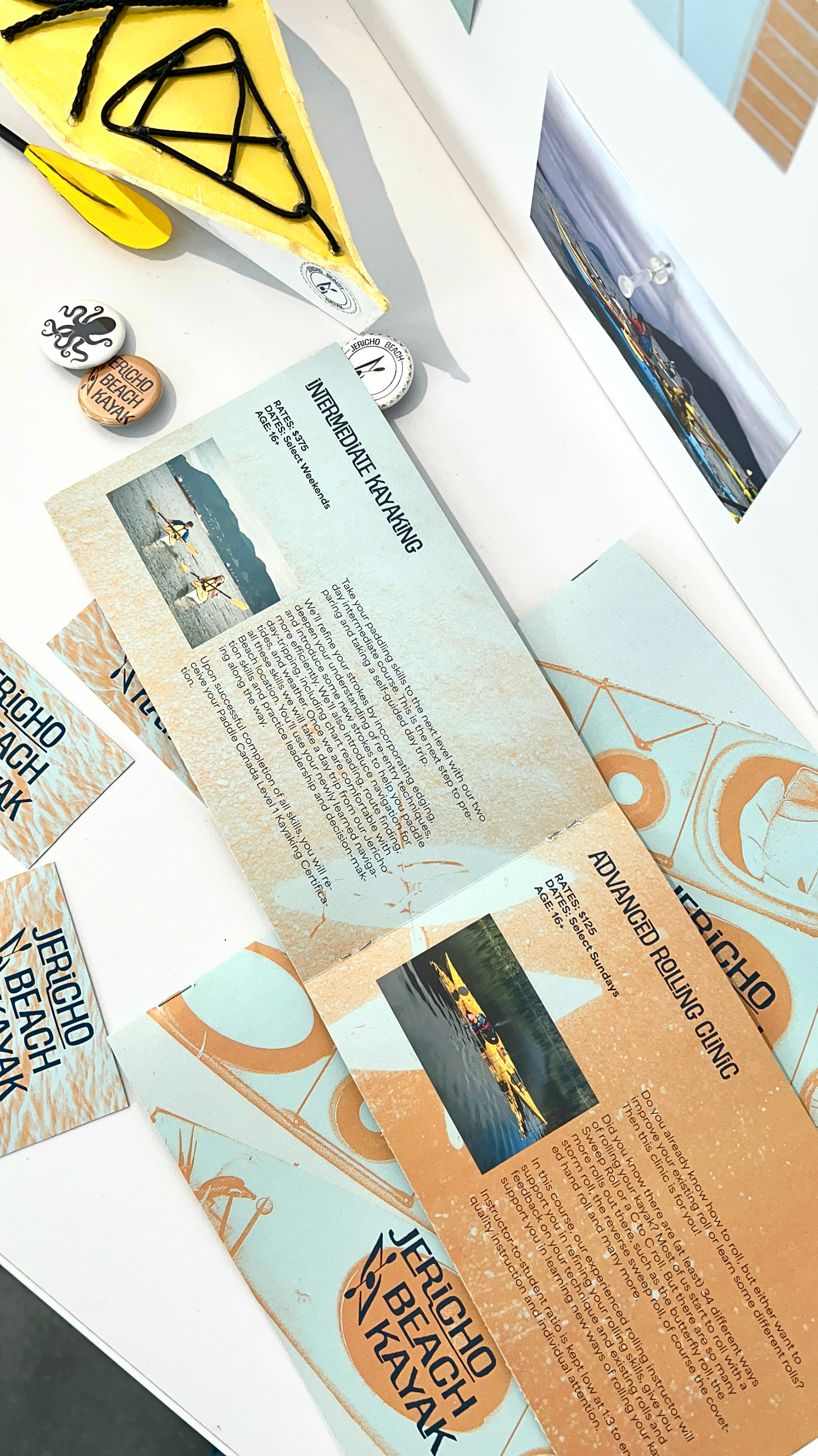
In addition to the logos, we created various assets, including buttons, business cards, pamphlets, and a booklet detailing their services. This project presented several challenges, but my partner and I successfully navigated them, which helped me strengthen my problem-solving skills, particularly in a collaborative setting.
Take a closer look at the project details!
